I Built My Own Thread in Subspace Builder
Part of a series
- Subspace Builder Series (9 of 9)
One of the things I like most about building my own site is that I get to build my own thread too. Not a social feed owned by someone else, not a product shaped around somebody else's defaults, but a place where I can decide what counts as an update, how it connects to other updates, and what it looks like when it lands.
I love this because it is fully under my own control and open to my own creative expression. I also do not have to be punctual in the usual sense. I can record things as I go, circle back later, add the missing middle, and generally write in a slightly non-linear, time-traveler way that feels much closer to how work actually happens.
There is also a simpler reason I enjoy this feature so much: I really enjoy building Subspace Builder itself. Writing and creating in Markdown, backed by a Git repo, is still one of my favorite combinations of technology for making things. Timeline entries gave that workflow a lighter-weight publishing surface, and relational entries push it further by turning the feed from a flat log into a threaded record of work.
The implementation behind this lives in PR #17, if you want to follow the feature work itself.
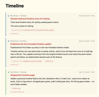
This is what the feature looks like in practice: a timeline feed that can show both entry type and thread context at a glance.
Timeline Entries Add a Lightweight Publishing Layer
One of the gaps in the site until now was the space between a full post and a private scratch note. Some updates deserve to be public, timestamped, and easy to revisit, but they do not need the weight of a long-form article.
Timeline entries solve that. They live in timeline/, use familiar front matter, and get rendered into a dedicated /timeline/ page as a stream of dated updates. Entry types are driven by tags rather than custom fields, which keeps the authoring model simple.
---
title: Shipped the timeline page
date: "2026-04-14"
time: "15:42"
tags:
  - timeline
  - shipped
---
That format matters for two reasons. First, it stays close to the rest of the content model, so writing a timeline entry feels like writing any other piece of Markdown in the project. Second, the explicit time field gives the collection stable within-day ordering, which is necessary once multiple updates can land on the same date.
The tags also pull their weight visually. shipped, published, wip, idea, and thinking each get their own color, so the feed can communicate whether an item is a release, a concept, or a work-in-progress before you even read the body.
Relational Entries Turn the Timeline Into a Thread
Flat timelines are useful, but they fall over a little once one piece of work evolves across multiple updates. You can see every entry, but the relationship between them still lives in the reader's head.
That is what relational entries fix. A timeline item can now point to another one as its parent by using the parent entry's URL path in front matter.
---
title: Published relational timeline entry
date: "2026-04-16"
time: "10:30"
parent: "/timeline/2026-04-14-shipped-timeline/"
tags:
  - timeline
  - published
---
This keeps the reference format dead simple: use the entry URL that already exists on the site. There is no extra ID system to maintain, and the relationship stays legible in the Markdown itself.
The build now validates those relationships as well. A parent value has to point at a real /timeline/.../ entry, it cannot point to itself, and it cannot create a cycle. That means broken relationships fail fast instead of quietly rendering bad UI.
The Feed Now Shows Context, Not Just Sequence
The /timeline/ page also changed to make those relationships visible at a glance. Instead of burying context inside each detail page, the feed now signals when an entry continues a previous one or has follow-ups of its own.
Child entries show a Continues from chip, while parents show a follow-up count. That preserves the quick-scanning feel of the timeline while making it obvious that some entries belong to a larger chain.
Timeline entries now show relationship cues directly in the main feed.
That small cue is important. Readers do not need to guess whether an entry stands alone, and they do not need to open a detail page blindly to find out whether there is more context above or below it.
Entry Pages Behave More Like Threads Now
The bigger UX shift happens on the entry pages themselves. Once you click into an item, the page now shows where that entry sits in a larger thread.
Ancestor entries appear under Earlier in thread, and direct children appear under Follow-ups. The interface reuses the same timeline card pattern as the feed, so the relationship view feels like an extension of the timeline instead of a second unrelated layout.
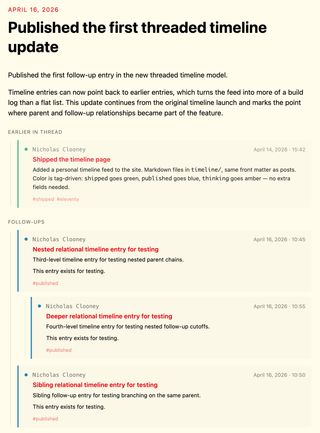
A timeline entry can now show both the context above it and the follow-ups below it.
That reuse matters more than it sounds. It means the same visual language carries through everywhere: timestamps, colored dots, title treatment, and tags all stay consistent whether you are skimming the main timeline or following a relationship chain in detail.
The ancestor stack also works across more than one level now. If one entry continues another, which itself continues something earlier, the detail page can show that chain in order rather than only exposing a single parent hop.
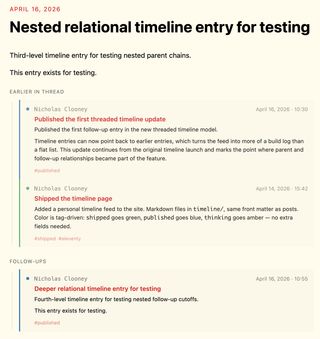
Nested parent chains can now render as a full thread instead of collapsing to a single parent hop.
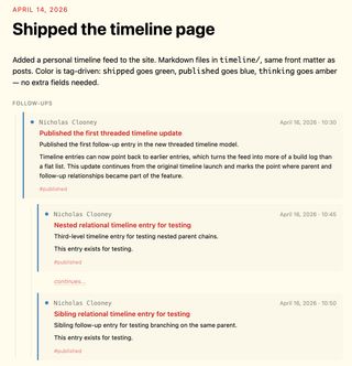
Parent entries also show their follow-ups, which makes the thread navigable in both directions.
The result feels closer to a threaded conversation or a build log than a traditional archive page. That is the right direction for this feature.
Why This Matters for the Builder
This is not only a nicer timeline page. It gives Subspace Builder a more useful publishing shape.
Posts can still do the heavy lifting when an idea deserves structure, screenshots, explanation, and polish. Timeline entries now cover the smaller moments around that work: the initial idea, the work-in-progress checkpoint, the shipped update, and the later follow-up when the feature evolves again.
Once entries can relate to each other, those smaller moments stop feeling disposable. They become a connected public trail of how a feature took shape.
That makes the site more useful as both a reader experience and a maintainer tool. Readers can follow the story of a feature without losing context, and authors can publish incremental progress without forcing every update into the mold of a full article.
The Timeline Feels Like a Real Build Log Now
The timeline started as a lighter publishing surface. With relational entries, it starts to become something more specific: a threadable build log for the site itself.
That is the part I like most. It creates room for public thinking without flattening everything into either "tiny note" or "full release write-up." Some work deserves a chain of small updates, and now the site has a native way to represent that.
With the screenshots in place, the shift from flat updates to threaded build-log entries is much easier to see.